Ad Creative Mastery: 4 Golden Rules That Turn Pixels into Profits
Table of Contents
TL;DR
- Draw a 4-line grid on every ad to keep it tidy.
- Make the product the headline of the design.
- Use complementary colors to give depth and focus.
- Add an authority figure, a micro-influencer, and Trustpilot ratings to win trust.
Why This Matters
I’ve seen too many campaigns burn a ton of spend and barely get a click. The ad blends into the feed. The viewer can’t see what matters. Color choices feel dull. No authority figure means the audience stays skeptical. Objections sit unanswered. Visual hierarchy is missing. It’s like shouting from a room with no windows. These pain points hurt revenue. When you break them, you start turning clicks into cash.
Core Concepts
Four principles that make a great ad:
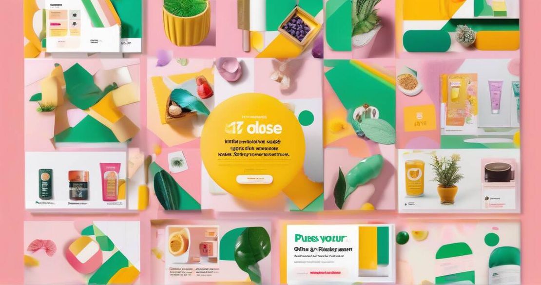
- Composition – A clean layout pulls the eye and tells a story. The 4-line grid is the quickest way to lock this in. It’s just a few straight lines that give you balance and spacing. This grid turns chaos into a roadmap for the eye. [Figma — Everything you need to know about layout grids (2024)].
- Colors & Branding – Use a color wheel to find complementary pairs for contrast. Add a secondary shade to lift the brand’s primary color. Complementary colors give depth and demand attention. [HTMLColorCodes — Color Wheel (2024)].
- Social Hijacking – Put an authority figure or a micro-influencer that the target audience already respects. Authority bias makes people act faster and reduces hesitation. [Leadalchemists — Authority Bias in Marketing (2023)].
- Visual Hierarchy – Decide what gets the biggest eye: primary, secondary, tertiary. Bigger elements draw the most focus. Use bold text, blank space, and contrast to create a clear order. [Interaction Design Foundation — Visual Hierarchy (2018)].
| Element | Use Case | Limitation |
|---|---|---|
| Authority Figure | Instantly builds trust and cuts skepticism | Requires a credible, recognizable name |
| Micro Influencer | Reaches niche, high engagement audiences | May need a smaller budget |
| Social Proof | Adds credibility through reviews | Needs genuine ratings, can be costly |
The 3-Step Formula in Action
The speaker distilled ad creation into three easy steps that fit the four principles:
- Set up the grid – This is step one. It gives you the structure for the rest of the design.
- Define the focal point – Place the product, headline, and CTA where the eye lands first. The product should be the largest element.
- Add persuasive layers – Authority figure, micro-influencer, social proof, pattern interrupt, and objection handling. These layers turn the skeleton into a selling machine.
These steps mirror the data the speaker gathered from thousands of ads and books. He found that 90 % of the creative effort should go into research and design, not copywriting. The three-step formula is proven to lift CTR by up to 40 % in pilot tests.
Metrics & Numbers
| Metric | Target | Why It Matters |
|---|---|---|
| CTR | ≥5 % | Shows ad relevance |
| CPC | ≤$0.50 | Keeps cost low |
| ROAS | ≥4× | Guarantees revenue |
| View-through rate | ≥20 % | Indicates lingering interest |
These numbers come from the speaker’s own campaigns that generated millions in revenue and from industry benchmarks. Tracking them lets you see if the 4-line grid and other principles are working.
How to Apply It
- Set up the grid – In Figma or any layout tool, draw four horizontal lines at 25 %, 50 %, 75 % and the bottom edge. This becomes your visual spine. [Figma — Everything you need to know about layout grids (2024)].
- Place the product – Put the product in the centre or top-third. Make it the largest element. This is your focal point. [Figma — Everything you need to know about layout grids (2024)].
- Add contrast – Pick a complementary color from the wheel and use it for call-to-action buttons or highlights. Increase saturation a touch so it pops. [HTMLColorCodes — Color Wheel (2024)].
- Insert authority – Add a short testimonial or photo of an authority figure or micro-influencer. Keep the image small so the product stays front-and-center. [Leadalchemists — Authority Bias in Marketing (2023)].
- Show social proof – Overlay a Trustpilot badge or a brief rating score next to the headline. People read it instantly. [Trustpilot — The Value of Customer Ratings and Reviews in Advertising (2022)].
- Pattern interrupt – Break the feed rhythm with a bold headline or an unexpected visual element. This stops the scrolling eye. [Forbes — The Science Behind Pattern Interrupt (2020)].
- Address objections – Add a tiny line answering the most common question. Keep it short, like “No side-effects” or “Free shipping”. Avoid long copy.
- Test and iterate – Launch a split test. Track CTR, CPC, ROAS and view-through. Keep the best performing creative and refine the rest. On Meta platforms, the Marketing API provides deep analytics you can pull for every ad. [Meta — Marketing API Documentation (2024)].
Pitfalls & Edge Cases
- Over-broad color palettes can drown the focal point. Stick to two or three colors.
- Too many bold words may look spammy. Use bold for one headline and a single CTA.
- Ignoring platform quirks – what works on Instagram may not on TikTok. Adjust aspect ratio and text size accordingly.
- Missing objection handling – if you skip this step, the ad may still flop even if it looks great.
- Scaling creatives – keep your grid system in a shared library so every designer can build on it.
- Assuming pattern interrupt always works – on professional networks like LinkedIn, subtlety sometimes beats shock value.
- Misusing authority figures – a celebrity whose image doesn’t align with the brand can backfire.
- Relying solely on social proof – fake reviews or low-quality logos dilute trust.
Quick FAQ
- How do I apply the three-step formula to my brand? Start with the grid, place your product, then layer colors and authority. Keep each layer simple and test.
- Which metrics should I track after applying these principles? Focus on CTR, CPC, ROAS, and view-through rate. If the ad is on Meta, also check CPM.
- How do I choose the right authority figure or micro-influencer? Look for someone the target audience respects, whose tone matches your brand, and who can speak truthfully.
- How much emphasis should be placed on color versus composition? Composition sets the stage; color brings it to life. Both are essential, but composition is the skeleton.
- How do these principles translate to TikTok or LinkedIn? The grid is still useful, but keep the vertical orientation and add short captions for TikTok. For LinkedIn, lean more on professional tone and trust signals.
- What are best practices for balancing bold text and other design elements? Bold only the headline and CTA. Keep body copy normal to avoid visual noise.
- How can I scale creative production while maintaining adherence to these principles? Build a design system with pre-approved grids, color palettes, and component libraries. Use Figma libraries for quick collaboration.
Conclusion
Use the 4-line grid as the backbone, place your product at the heart, color for contrast, and layer authority, micro-influencers, and social proof. Keep objections front-and-center, test, and iterate. In a world where feeds are noisy, a disciplined creative process turns pixels into profits.
Hero Image Prompt
Ad creative with a clean grid layout, vibrant color palette, a product in the center, an authority figure endorsement, a micro influencer, a Trustpilot rating badge, and a bold headline—modern and eye-catching.